journal

writing, radio,
archives

intention

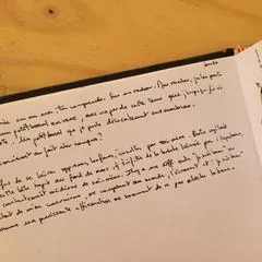
I write the way I draw: to keep a trace, to question what surrounds me and sometimes to look at things differently.

“Art isn't in the tools, the materials or the equipment you use. It's in the way you see the world. ”

Rick Rubin
24 June 2026

Re-lecture in process

Following on from ongoing research: signs, motifs, visual language, primal forms.

read the article ↓close ↑

Following on from ongoing research: signs, motifs, visual language, primal forms.

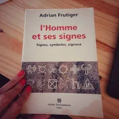
On my studio table today: Signs and Symbols, by Adrian Frutiger.

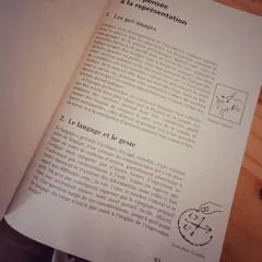
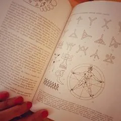
A major Swiss typographer, Frutiger designed the typefaces Univers, Frutiger and Avenir, among others. In this book, he mainly explores what precedes and runs through writing: signs, symbols, gestures, representations, traces.

“Language preceded writing.”

Before the letter, there is the body.
Before the logo, there is the sign.
Before the form, there is the gesture, and that human need to leave a trace.
And before the word, perhaps, the silence from which signs are born.

dibidibiwaaap!

next article: Carnet de voyage de 2017 →

24 June 2026

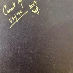
Travel sketchbook from 2017

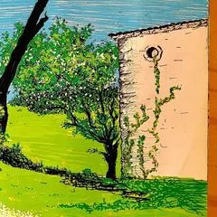
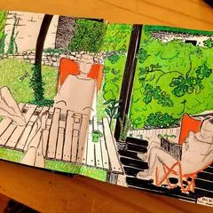
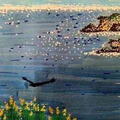
Finding these scribbled pages again, these half-legible notes, full of bold colours, overflowing plants, leaning buildings, improbable animals…

read the article ↓close ↑

Finding these scribbled pages again, these half-legible notes, full of bold colours, overflowing plants, leaning buildings, improbable animals, fragments of landscapes and thoughts caught along the way.

Not so much a “tidy” sketchbook. More a living one.
A place where memories are not filed away, but laid down.
As they come. With their wobbly lines, their stubborn details, their tiny flashes.

Before the files, the exports, the briefs and the sign-offs, there was this: observing, noting, drawing, getting it wrong, starting again.

No Ctrl Z. With traces that stay, visible accidents, paths you can't quite erase.
And that's what's good.

Opening it again, I mostly find one thing: this way of looking never really went away.
It may have changed form, medium, rhythm.
But it's still there, at hand.

dibidibiwaaap!

next article: Retour aux mains pleines de couleurs →

24 June 2026

Back to hands full of colour

Working behind screens all the time, you'd almost forget the smell of paper and the dust of pastel.

read the article ↓close ↑

Working behind screens all the time, you'd almost forget the smell of paper and the dust of pastel.

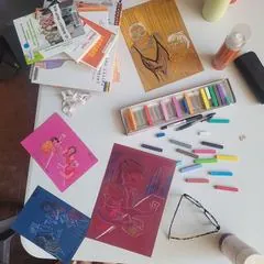
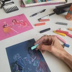
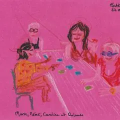
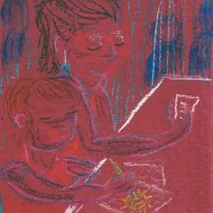
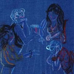
For the “Femmes en Fêtes” project of the Association Terre-Contact in Fontès, I took out my old sticks of colour.

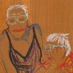
Tinted paper, a few pastels, a table, and faces telling their stories.

Not so much faithful portraits.
Rather a few traces of encounters, caught between two sentences, a laugh or a silence.

It had been a long time since I'd worked like this.
And I had missed it.

Thank you to Marie Laloum for her trust, and to the whole team for a really, really lovely shared moment.

dibidibiwaaap!

next article: Quinze ans, un objet juste →

1 April 2025

Fifteen years, a fitting object

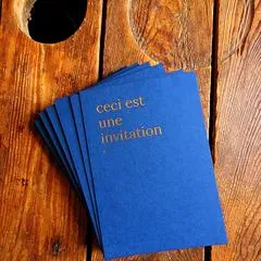
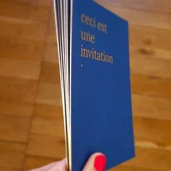
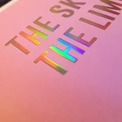
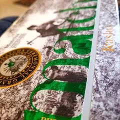
Colorplan Sapphire 700g. Gilded edges. Material, weight, presence. Quietly.

read the article ↓close ↑

Colorplan Sapphire 700g.
Gilded edges.
Material, weight, presence.
Quietly.

I wanted a fitting object.
A printed gesture.
To mark these fifteen years.

Fifteen years of road, of learning, of doubt too — a lot of it.
And of joy, often.
A crossing, patiently built.
From the bay of Inhambane to this land that welcomes and inspires me today.

Thank you to Atelier Bulk for their precision and goldsmith-like work.
Every detail counts, especially when it doesn't impose itself.

That moment isn't announced.
It is shaped.

dibidibiwaaap!

next article: De retour du C!Print Lyon 2025 →

5 February 2025

Back from C!Print Lyon 2025

Braving the freezing night from 2:30 a.m., chaining car, train, tram and bus under a Lyon sky as cold as it was grey… it was all more than worth it.

read the article ↓close ↑

Braving the freezing night from 2:30 a.m., chaining car, train, tram and bus under a Lyon sky as cold as it was grey… it was all more than worth it.

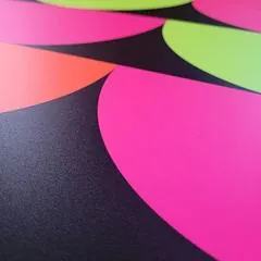
C!Print, the big gathering of visual communication and the graphic industries, is not a fair aimed directly at graphic designers, and yet the conversations with printers were invaluable. Seeing the differences between machines first-hand, understanding file processing, watching white underprints being printed, handling files for gilding and cutting lines, the specifics of new technologies… special mention for UV flatbed printing, which gives solid areas of exceptional density, especially black, reaching a depth rarely seen. The addition of fluorescent inks opens impressive creative prospects, with vibrant, luminous colours whose rendering simply blew me away.

I'm coming home with at least 10 kg of samples: papers, labels, fabrics… not to mention the flood of ideas, encounters and inspiration. My feet haven't touched the ground yet.

I came to C!Print with one question firmly in mind: how file preparation differs from machine to machine, how feedback is handled, how error correction is moving towards automation. I was welcomed with great kindness, patience and generous explanations, confirming that a smooth dialogue between graphic designers and printers is more than essential.

A huge thank you to

  • Alliance Étiquettes, for our great conversations, their Collection 05 by Curiosity, a real creative jolt, and the sumptuous possibility of printing on pewter.
  • Print.com, for our warm exchanges; I already work with them on some projects, including my illustrations, which you can find in Lattes.
  • swissQprint, whose flatbed printers amazed us all with their quality, speed and depth of colour. We even left with an A0 sample, just like that.
  • Atelier-Sud, from Gignac to Lyon, for their incredible range of colours in embroidery. At that level, it's art.
  • Antalis France and HP, who took precious time to talk with me about preparing files for HP machines and the value of keeping regular, steady relationships between printers and graphic designers.
  • Canon France, and its impeccably precise raised printing.
  • Adesa labels, for their inspiring solutions. They're just next door, in the Gard.
  • Etac-Réseau labels, for a fascinating conversation about how the printing world is changing.
  • Decq, and their new generation of 3D visualisation software for printing and online personalisation.
  • Konica Minolta France, for the flawless quality of their prints.
  • Kalisign France, for illuminated, creative signs and incredibly fine neon, down to 3 mm.
  • the many screen-printing and textile-printing stands, not forgetting the advances in packaging and 3D textile printing.

C!Print is also an immersion in a whirlwind of machines, innovations and trends, where big names and newcomers cross paths. Hundreds of exhibitors, quality talks, a fair that pulses to the rhythm of the graphic industries' evolution.

I even got to watch the vehicle-wrap contest, somewhere between hippie culture and metal, surrounded by Porsches and Volkswagen vans, and to attend the talk “Imprimer responsable” (printing responsibly), led by journalist Marie Leynaud.

I'm coming home with a pile of samples to touch, smell and study at the studio. If you feel like it…

In 2026, I'll go back for at least two days, and also take time to explore CTCO, the reference event for promotional objects and textiles. Because yes, communication objects still have pride of place and a bright future.

Back under the blue sky of our beloved region – some things never change – I'm off to dream, structure and refine this creative whirlwind, so my proposals for communications solutions are spot on. Because creating a visual identity isn't just drawing a logo; it's also knowing how and where to use it, understanding the media, mastering printing techniques and turning a vision into a strong, coherent presence.

Thank you for taking the trouble to read this long piece, to those who made it this far! Those who know me know I never do things by halves. Now, on to experimenting, ideas and the next creations.

dibidibiwaaap!
next article: Étiquette de vin, Fulcrand Cabanon →

16 February 2023

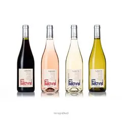
Wine label, Fulcrand Cabanon

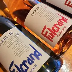
It was a great pleasure to give a new look to the label of the Fulcrand Cabanon bottles, emblematic of the cave de l'Estabel…

read the article ↓close ↑
The Fulcrand label with Sara, a video by the cave de l'Estabel · watch on YouTube ↗

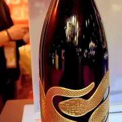
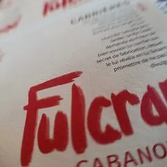
It was a great pleasure to give a new look to the label of the Fulcrand Cabanon bottles, emblematic of the cave de l'Estabel, on the uniquely characterful schist terroir of Cabrières (Hérault).

From design to print run, watch how the new Fulcrand Cabanon label was made, in a video on the Estabel channel.

  • Paper: Fedrigoni Paper
  • Printer: Estrabols Imprimeur
  • Video and editing: Mathias Leclerc
  • Label graphic design: terragrafika®

A really lovely collaboration on a magnificent terroir! Thank you all for your trust.

dibidibiwaaap!
back to the first article ↑

radio · encounters and voices

In 2018, I took part in founding Onda Païs Radio. A collective adventure made of encounters, listening and shared words.

On ne vient pas à Bédarieux par hasard

A programme on Onda Païs Radio, co-hosted with Thierry Riou, also broadcast on Radio Pays d'Hérault.

episode #2 · 27 May 2026 ↗a few episodes ↗on RPH · 29 May 2026 ↗on RPH · 1 May 2026 ↗

Paroles de vies (Words of lives)

The programme of our memory keepers. Yesterday they lived what we are living today. Tomorrow we will be what they are today.

Passions, work, doubts, fears: every week, at the hospital in Bédarieux, guests share their memories in an intimate setting. Produced and presented by Thierry Riou and sara liliane fernandez, with occupational therapist Gaëlle Jaumain.

listen to the series ↗

Vivre la nuit, guest

On Radio Pays d'Hérault.

Ethio Jazz, the expression of free human beings · 16 February 2024 ↗

Have a project in mind?info@terragrafika.fr ↗